


LIFE
VIA
PORTUGAL
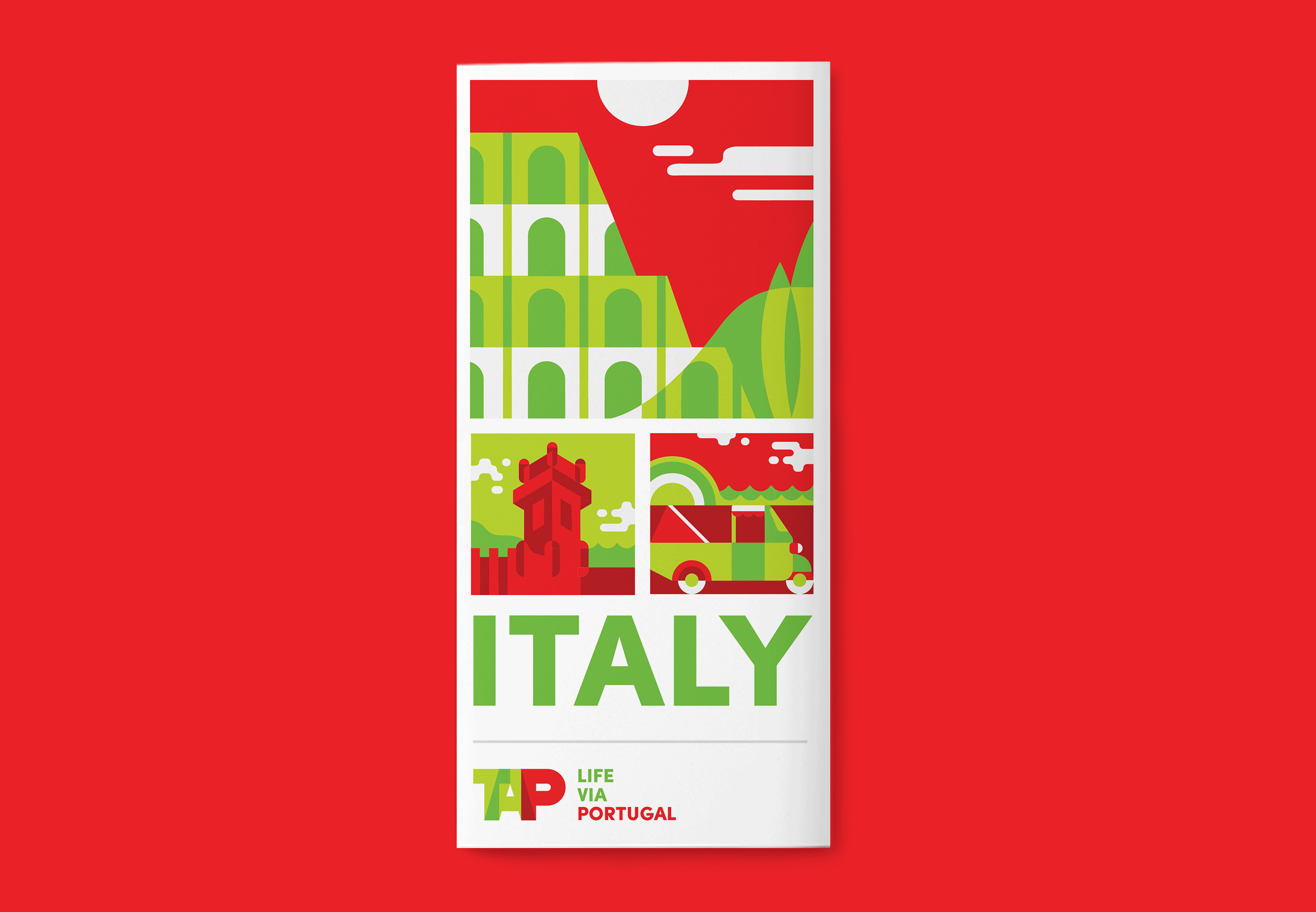
DESIGN, ART DIRECTION, ILLUSTRATIONIn 2017, TAP Portugal was aiming to take over the US and Canadian markets, and make North Americans travel the world via Portugal, with competitive prices and an invincible Stopover offer. But that alone doesn't do the job: the most compelling reason to make users spend their PTO's and travel with TAP was Portugal itself.
To make people see all the places and experiences they could have when flying with the company, a powerful visual identity was developed, inspired by everything Portugal and showing the world through TAP's lenses.
The results of this bet of TAP in the North Atlantic were felt immediately: the number of passengers transported in the USA routes doubled; the average monthly seat-occupancy reached over 85 per cent and, since the launch of the latest campaign the company saw an increase of 42,9 million dollars in sold income, comparably to the previous year.
All it took for them was to show up in style.
Client • TAP Portugal
Agency • BBH New York
︎